Content Best Practices
The purpose of the University of Nebraska at Kearney’s Graphic Design Guidelines is to ensure accuracy, consistency and protection of the University’s brand identity and image. It provides a set of minimum standards for content designed by students, faculty and staff. The following general guidelines are expected to be adhered to when creating UNK digital signage and graphic design elements that promote campus events and activities:
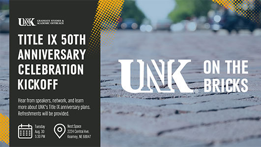
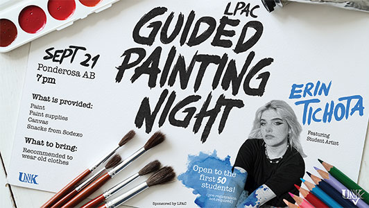
- Name and/or title of the event, activity or presentation
- Date, time and location
- Short web URL or QR Code that leads to more details and information is recommended
Design Best Practices
- Image should be high resolution .jpg or .png and landscape-oriented with a 16:9 aspect ratio (1920x1080). It is important to realize this is a horizontal, widescreen format. Vertical displays / posters will not be accepted.
- Include a photo. It’s an important visual that makes your graphic stand out.
- Include your organization and/or UNK logo. That branding is important and expected. Download approved UNK institutional marks and logos can be downloaded on our website.
- Digital slides are generally displayed for 15 to 20 seconds at a time. Due to the rotating nature of digital signage, concise messages are critical. The simpler the graphic, the better the communication will appear. Limit word count to no more than 30 words per slide. A maximum of 6 lines is also a good target. Remember, most people are walking by the displays. (This is NOT a captive audience.)
- Keep fonts simple and legible. Never use more than two font styles in a single graphic. Use italics sparingly, as they can be hard to read from a distance. It is best to avoid light, ornate fonts with thin lines because they are difficult to read. Simple sans-serif and serif fonts are recommended (such as Univers, Utopia, Minion, Franklin Gothic, Calibri, Helvetica or Myriad Pro)
- Good contrast improves legibility. Dark backgrounds should utilize light foreground colors. Light backgrounds should utilize dark foreground colors.
- The preferred identification color for UNK is blue Pantone Matching System 294 (PMS 294) and CMYK Process C100%, M69%, Y7% and K30%. For more detailed guidance view Graphic Standards Quick Guide.
Information in all graphics will be reviewed for content and clarity. If the signage has any grammar or typographical errors, is not sufficiently legible, is the wrong format or has other errors, it will be rejected and returned for corrections and/or revisions.